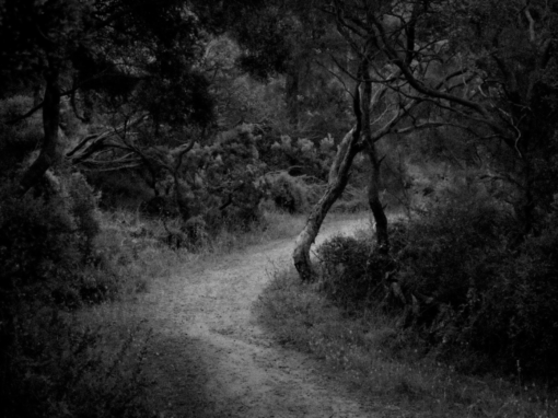
Leaving an appointment with my primary care doctor, I noticed the windows of a dialysis center across the street. The building caught my attention—not because of visible activity, but because of its quiet presence. The parking lot was full, suggesting lives and routines unfolding inside, unseen. Curious about how the place would feel without movement, I returned on a Sunday afternoon.
Using a Canon SX-60 with the zoom set to 800mm, I made several exposures and compositions from a distance. The long focal length compressed the space, emphasizing pattern, repetition, and structure rather than narrative detail. What interested me was not the specificity of events, but the visual tension between order and implication—the way architecture and light can quietly suggest human dependence and endurance.
In post-processing, I removed some branches and bushes from the lower portion of the image using Photoshop. I am not a journalist, and I don’t approach photography as a record that must remain untouched. Editing, for me, is a way of clarifying intent and achieving what I felt and saw—removing distractions so the underlying structure of the image can be seen more clearly. The goal is not to fabricate reality, but to distill it.
My work is driven by observation and return: noticing something ordinary, then revisiting it under different conditions to better understand its form and meaning. I try to capture either the order and balance of the world, or its quiet chaos—sometimes both at once.
What are the TWO most impactful features that make your image a good photograph? Don’t be shy!
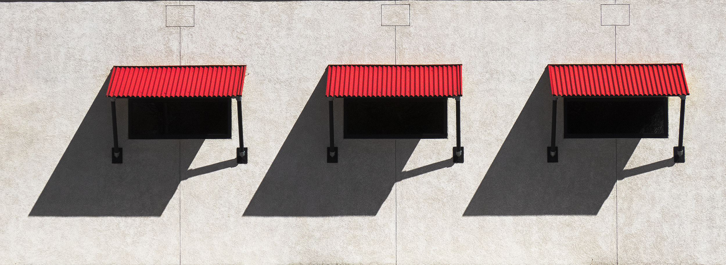
Repetition with subtle variation
The three identical window structures create a strong rhythmic pattern across the frame. This repetition establishes order and visual stability, while the slight differences in shadow angle and interior darkness keep the image from becoming static. The eye moves laterally, comparing forms, which sustains engagement.
Light and shadow as compositional structure
The sharp, angular shadows are not secondary—they are equal partners to the architecture. They introduce tension and direction, cutting diagonally across the otherwise flat, rectilinear surface. The contrast between the bright wall, deep shadow, and red awnings gives the image clarity, depth, and graphic strength, turning a simple façade into an abstract study of balance and restraint.
If you could make this photo again, what would be the ONE thing you would like to do better or differently?
If I took this photo again, I would like to make the image with a higher resolution camera and a sharper lens.
Robert Petersen shared this photograph with the FRAMES Facebook Group.
Photographer
Robert Petersen, Fallon, Nevada, USA
Equipment and settings
Canon SX-60
F8, 1/1000, ISO 100, RAW capture

FRAMES is a unique international photography community that combines the best of all worlds, bringing you print and digital publications, a global membership platform, access to live events, and a dedicated mobile application.
EXPAND YOUR PHOTOGRAPHIC VISION
JOIN FRAMES TODAY