“American Colour” is an ongoing series of images I’ve been creating for the past six years, a personal journey into the visual soul of the United States. A selection from this expansive body of work was recently published as a zine by the Glasgow Gallery of Photography, titled Southern Exposure. This publication focuses on the unique and often ethereal light of the American South, a light that seems to saturate everything it touches with a particular kind of melancholy beauty. It’s a tribute to the subtle, vibrant hues that define a landscape I’ve come to know intimately.
My artistic perspective is deeply influenced by the work of photographic masters like Stephen Shore and William Eggleston. They taught me to see beyond the obvious, to find beauty in the everyday and the seemingly mundane. Their groundbreaking use of colour, once considered a commercial gimmick, elevated it to a tool for serious artistic expression. Following their lead, I’ve spent years training my eye to look for the grace notes in the visual symphony of everyday life. This series is my attempt to apply that lesson to the very fabric of American society—the ubiquitous landscapes of malls, trash cans, gas stations, and the intricate web of roads that connect them all.
The Allure of the Mundane
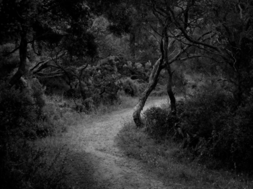
There’s a prevailing assumption that art must depict the spectacular. We’re conditioned to seek out grand vistas, dramatic events, and heroic figures. Yet, for me, the most compelling narratives are often found in the overlooked spaces. The parking lot behind a strip mall, the weathered paint on a public trash can, the stark geometry of a road intersection at dusk—these are the settings where the unvarnished truth of modern life resides. They are the backdrops of our daily existence, places we move through without truly seeing. My goal with “American Colour” is to pull these scenes into sharp focus, to reveal the inherent artistry in their ordinariness.
This approach is not about romanticizing decay or poverty. It’s about a deeper kind of seeing, a recognition that the banal is not empty but full of quiet stories and visual poetry. The way sunlight hits the plastic of a discarded fast-food cup, the intricate patterns of oil stains on asphalt, the faded neon of a motel sign—these are the details that tell the story of a culture. They speak of consumption, of movement, of transient lives and forgotten moments. In a world saturated with carefully curated, hyper-perfected images, there’s a certain honesty in capturing the raw, unpolished reality of these spaces.
The Influence of Eggleston and Shore
The journey into this aesthetic began with my deep admiration for William Eggleston. He is often credited with legitimizing colour photography as a fine art medium. Before him, colour was considered too commercial, too superficial for serious artistic work. Eggleston changed that perception with his seminal 1976 exhibition at the Museum of Modern Art. He showed that a photograph of a red ceiling or a tricycle could be as profound and emotionally resonant as any black-and-white landscape. His work taught me to appreciate the power of saturated colour, to see it not just as a descriptor but as an emotional force. The way he used light to create a sense of mood and mystery, even in the most straightforward scenes, was a revelation. It encouraged me to experiment with different times of day, to understand how a low sun or the harsh midday glare could completely transform a familiar scene.
Stephen Shore’s work, on the other hand, provided a different, yet equally vital, lesson. His series “American Surfaces” and “Uncommon Places” were chronicles of his cross-country road trips in the 1970s. He photographed everything—hotel rooms, meals, street corners, people he met along the way. His approach was more systematic and documentary, a kind of visual diary of the American landscape. What I find so compelling about his work is its quiet, almost forensic quality. He presented these mundane details with a dispassionate clarity, allowing the viewer to fill in the emotional gaps. His photographs showed me that a simple, head-on composition of a diner countertop or a gas station could possess a monumental quality. They elevated the prosaic to the iconic. Shore’s work validated my own interest in mapping and documenting the visual language of the American road, urging me to see the patterns and repetitions in the built environment.
Southern Exposure: The Light and the Colour
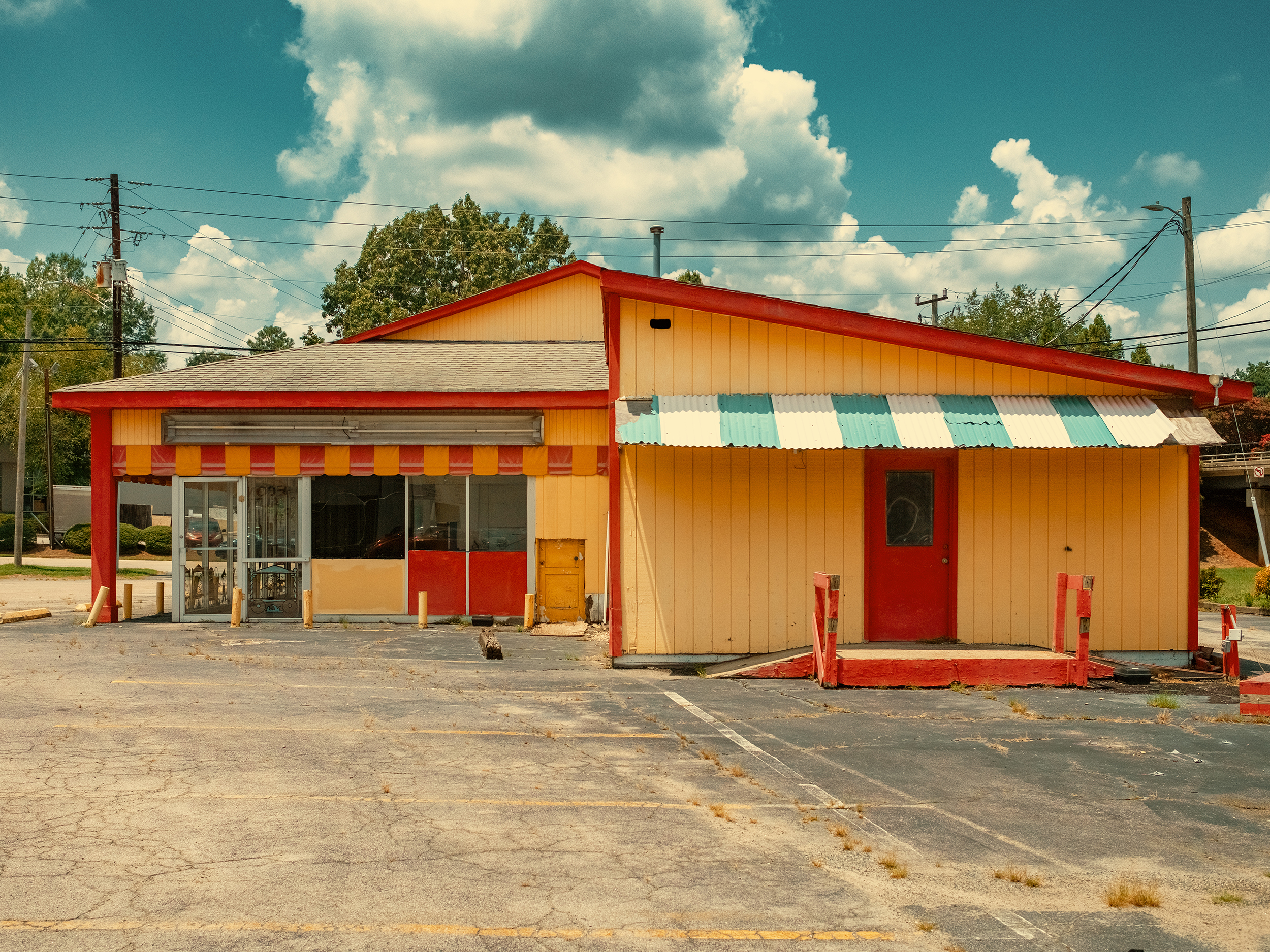
The zine Southern Exposure is a concentrated expression of these influences, focusing specifically on the Southern states. The South has a unique character, and a large part of that is its light. It’s often thick and humid, diffused by the moisture in the air. This creates a soft, almost painterly quality, a kind of atmospheric haze that can make colours appear both more intense and more muted at the same time. The greens of the vegetation are a deep, almost tropical hue, and the sun can bleach a white wall to a brilliant, almost blinding brightness.
In Southern Exposure, I sought to capture this specific luminosity. There are photographs of dilapidated gas stations bathed in the golden light of late afternoon, the peeling paint on their walls reflecting a history of forgotten journeys. Other images show the harsh, unfiltered light of midday, casting deep, sharp shadows under the eaves of a porch or illuminating the faded colours of a forgotten roadside diner. This light is a character in itself, shaping the mood of each photograph and imbuing it with a distinct sense of place.
The colours of the South are also unique. They are not the crisp, clean colours of the desert West or the muted tones of the Pacific Northwest. They are a rich tapestry of vibrant and sun-bleached hues. The bright turquoise of a motel swimming pool, the faded pink of a motel sign, the deep reds of a weathered brick wall—these are the colours that tell the story of the region. They speak of heat, humidity, and a slow, languid pace of life.
Malls, Roads, and a Visual Grammar
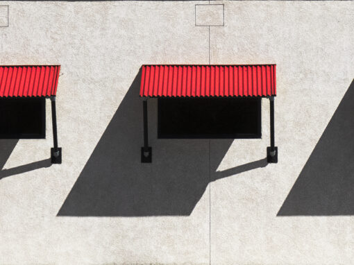
The recurring subjects in “American Colour”—malls, gas stations, roads—are not random choices. They are the arteries and organs of the American landscape. Malls, once bustling centres of commerce and social life, are now often ghost towns, their grand architectural facades a testament to a changing world. Photographing their empty parking lots and closed storefronts is an act of documenting a kind of cultural elegy. It’s about capturing the quiet aftermath of a consumerist dream.
Gas stations and road junctions, in contrast, represent motion and transience. They are the points of connection, the spaces where we stop to refuel before continuing on our way. They are inherently impersonal, designed for utility rather than beauty. Yet, in their functional design and repetitive forms, there’s a stark, almost brutalist beauty. The sweeping curves of an overpass, the stark lines of a road sign against an empty sky, the geometry of a service station forecourt—these are the elements that form a kind of visual grammar, a language that every American understands on a subconscious level.
My work aims to translate this grammar into something new, to find the human stories hidden within these impersonal structures. It’s about seeing the small, poignant details—a single plant growing through a crack in the asphalt, the way a piece of litter has been caught by the wind, the subtle variations in the colour of a concrete wall. These details, when viewed through a lens that seeks beauty in the everyday, become powerful signifiers of a shared experience. They are the quiet evidence of lives lived and journeys taken.
“American Colour” is an ongoing conversation with the American landscape, an attempt to understand it not through its grand monuments or natural wonders, but through its humble, overlooked spaces. It is a tribute to the legacy of photographers who showed us how to truly see, and a personal exploration of the light, colour, and texture of a world that is at once vast and intimately familiar. It’s a project that continues to evolve as I travel, constantly seeking new moments of quiet beauty in the rich tapestry of American life. The road, as they say, goes on forever.
What are the TWO most impactful features that make your image a good photograph? Don’t be shy!
Symmetry and colour.
If you could make this photo again, what would be the ONE thing you would like to do better or differently?
Possibly shoot at a different time of day.
Stuart Borland shared this photograph with the FRAMES Facebook Group.
Photographer
Stuart Borland, Glasgow, UK
WEBSITE (under construction)
Equipment and settings
Fujifilm X100VI

FRAMES is a unique international photography community that combines the best of all worlds, bringing you print and digital publications, a global membership platform, access to live events, and a dedicated mobile application.
EXPAND YOUR PHOTOGRAPHIC VISION
JOIN FRAMES TODAY