
In 2015 I was commissioned through the studio I work for to create some photo art pieces for the corporate offices and hallways of a plastics manufacturing company. I’ve shot commercial work for this company for years, have a good relationship with their in-house marketing/art director and she chose me to do the work. The only guidelines from her bosses was that the subjects be materials that they manufacture at the facility. As typically commercial image producers, we were both excited to do some genuinely creative work.
A few days before the shoot we spent some hours at the facility rummaging through the sales samples and warehouse looking for interesting materials, really striking gold when I discovered the recycle bins at the ends of the production lines. Plastic extrusion cutoffs from the beginning and end of runs, and throwaway offcuts from molded pieces formed amazing shapes and textures. From all this we loaded up a couple of dozen items we thought could give us some interesting results..
Back at the studio I spent two days experimenting with a huge variety of shapes, lighting techniques, camera angles, etc., shooting everything any way I could think of. The art director reviewed the shots as we went, and we discussed the ones she responded to, adjusting the process to hone in on things we thought were working well.
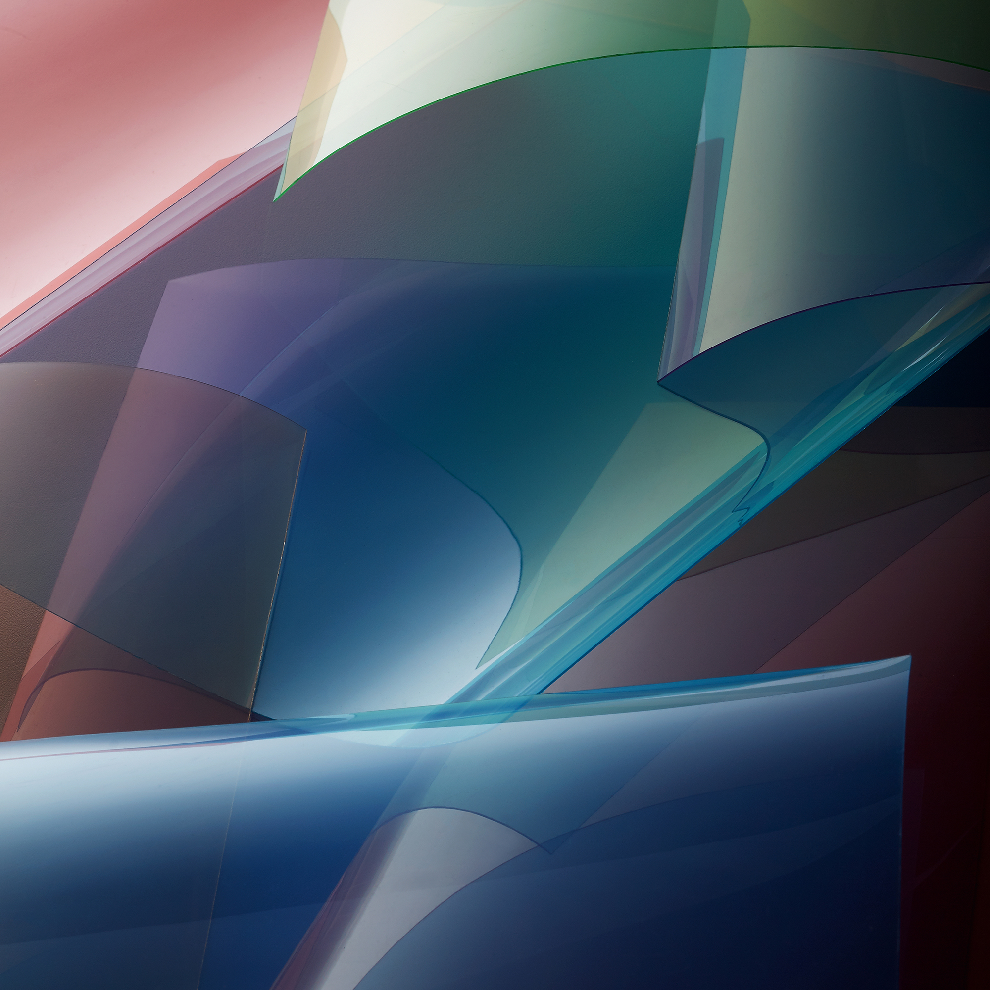
This particular image is a shot of multiple sheets of transparent colored acetate, bent, twisted and layered on top of each other. What you see is the combination of transparent color, colored shadows and glossy surface reflections creating layers of ambiguous space and expanding the range of the color palette where they overlap. This is a straight photograph with some contrast and saturation adjustments. No Photoshop tricks other than cleanup of some dust, smears and ragged edges.
What do you think are the TWO most impactful features that make your image a good photograph? Don’t be shy!
I would say the formal aspects have a strong impact; the color, shape, line and tonality are rather striking and I believe balance compositionally very well. And the fact that it’s a true abstract, which enhances the significance of the formal energy. It has a cubist feel, full of ambiguous spatial relationships and no clear subject, while the gradient highlights on the material still identify it as a photograph. The simultaneously reflective and transparent qualities of the material lend itself to this very well.
If you would be able to make this photo once again, what would be the ONE thing you would like to do better or different?
I explored this subject pretty thoroughly at the time this picture was made. Lots of experimenting with bending and combining the material in different ways with different camera angles and qualities of light used to describe it. This one and some others from that shoot checked all the boxes for me, so I don’t think I’d really do anything different with this specifically.
Patrick Arnold shared this photograph in the FRAMES Facebook Group.
Photographer
Patrick Arnold, Columbia, Illinois, USA
Equipment and settings
Studio, white table with a 5×6 ft translum scrim angled over the table. Profoto strobe head with a modified ancient and dented 20” Speedotron soft silver reflector with some half tough spun taped over it to soften up the light more, skimmed at an angle across the scrim. White foamcore fill card somewhere on set, moving around as needed. Canon 5Ds camera handheld and tethered to an iMac shooting to CaptureOne. Don’t remember the lens, probably a 100mm 2.8 macro. Exposure was whatever it was to get the look I was after. I don’t pay much attention to exposure settings in the studio unless I’m trying to control a very specific depth of field, then adjust the strobe power accordingly.

FRAMES is a unique international photography community that combines the best of all worlds, bringing you print and digital publications, a global membership platform, access to live events, and a dedicated mobile application.
EXPAND YOUR PHOTOGRAPHIC VISION
JOIN FRAMES TODAY
Terrance+Wimmer
October 26, 2021 at 21:41
Very cool on many levels. Glad you had a good relationship with the art director or this idea could’ve died a very lonely death. Very edgy work for corporate offices, which is even more reason for praise. Sounds like you really put in the work on this project. The end result is very beautiful on any level. Thanks for the insight.
Terrance+Wimmer
October 26, 2021 at 21:43
Sorry… meant to ask. How large did these wind up being printed?
Patrick Arnold
October 27, 2021 at 14:13
Thank you much for the kind words Terrance! I never actually saw any of them printed but I saw a couple of the spaces where they would hang. I believe some of the smaller ones were to be 3’x or so and bigger ones at least 6-8 feet long.
I worked a day last month with the art director and we talked about these shots a bit. Apparently they still use them all the time for backgrounds and graphic elements in printed material in addition to art in the offices.
Terrance+Wimmer
October 29, 2021 at 20:42
Thank you. I was hoping that they were printed large. It’s a wonderful series of images.