While working on a book about Portugal a number of years ago, a Portuguese photographer friend showed me an image he had made of the exterior of the modernist church at the Sanctuary of Fátima, a Catholic pilgrimage site in the city of Fátima, which attracts many visitors from around the world.
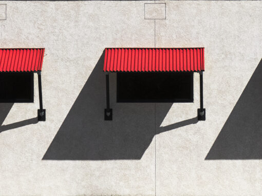
His image inspired me to drive 80km from my base near Caldas da Rainha to make my own image. Having done some research about the church and seen a number of photographs, my intention was to capture the essence of the minimalist, possibly austere, architecture, probably in black and white.
On the day this photograph was taken it was a hot day with many visitors milling around the facade of the building. I could see this would make it difficult to form a composition pleasing to my eye. The image I had in mind should be devoid of tourists, a simple composition without distraction, although a religious human element would give context and scale.
I strolled around the perimeter of the site to get a sense of what might work from afar, then I made my way towards the facade and saw that interesting shadows had formed under overhangs. Shading myself from the sun under one of the square arches which forms an imposing passageway from the entrance, I could see that strong, acute, shadows added drama from this viewpoint. After a wait of about 45 minutes patience paid off when people disappeared from view, for just a short while. As I composed my shot I could see a nun through the corner of my eye, who kindly walked into shot, and across the frame, so that I could make this image.
The title ‘colossus’ is probably self explanatory, which I think suitably defines the scale and importance of this religious site.
What do you think are the TWO most impactful features that make your image a good photograph? Don’t be shy!
Composition (structure) and light (shadows).
If you would be able to make this photo once again, what would be the ONE thing you would like to do better or different?
In a perfect world the bottom points of the two triangular shadows would reach the ground, and if the nun had been wearing a white robe it would have been more visually pleasing.
Mark Benham shared his photograph in the FRAMES Facebook Group.
Photographer
Mark Benham, Bath, UK
Equipment and Settings
Canon 5D Mark II + EF 24-105mm
f/4, 1/320 sec, ISO 100


Adrian Hill
July 13, 2020 at 22:01
fine work. Memorable piece worthy of any gallery wall.
Mark Benham
July 14, 2020 at 10:43
Thank you Adrian.
Nigel Walker
July 13, 2020 at 23:00
Great composition and light. The fact you went with one idea but showed flexibility should be borne in mind by all photographers.
Mark Benham
July 14, 2020 at 10:45
Thank you for your comment Nigel.
Alun Wyld
July 14, 2020 at 02:41
very nice!
Mark Benham
July 14, 2020 at 10:45
Thank you.
Jose Alvarez
August 29, 2020 at 13:45
I wholeheartedly agree with, “Composition and light and shadow”. 📷
Eric H. Adeleye
July 15, 2020 at 09:30
Excellent photograph.
Mark Benham
July 23, 2020 at 18:08
Thank you Eric.
David Brandy
August 13, 2020 at 22:36
I love architectural images, especially with a large dose of the abstract, which is what I love about your shot. Even more so if there had been no human presence as you had first intended. But the Nun grounds the shot and gives it a sense of place. Interestingly, I bet if this was a colour shot it would still look black and white. Great work!
Mark Benham
August 16, 2020 at 13:18
Thank you David