
The Erasure project is a response to political change. It is partly a mindful act and self-therapy, and part didactic exercise focused to encourage people to both meditate and reflect on the creative act and the underlying message. I want my audience to engage the image and allow the details to fade away as they deeply think about what erasing means. For me, it’s the violent act of removing, deleting, or destroying something.
Like other projects I’ve developed, this one is deliberatively repetitive and akin to a meditation. I want to document the process of erasing something and do it repeatedly until I feel a sense of calmness. This one is less about acceptance and more about understanding what is happening, how I feel about it, and my hope to have a conversation with others who may or may not share my beliefs or perspectives.
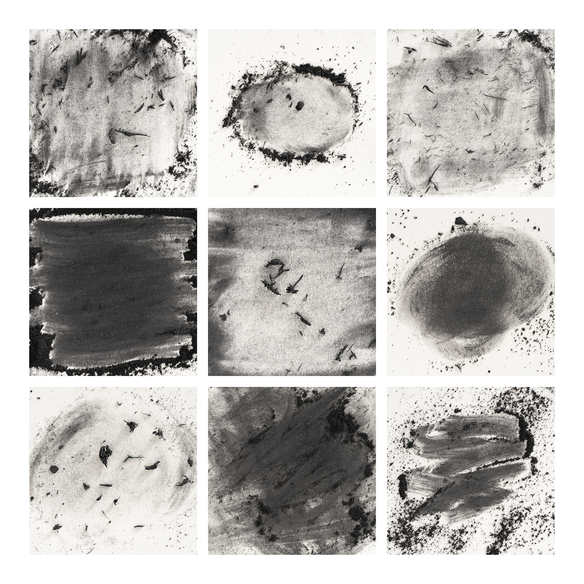
For this project, I use graphite on paper as the subject and the medium. I simply sand the graphite on the paper and then proceed to erase it … repetitively. I am working with both pure abstractions and intentional words. Most of the images are created to produce a triptych which documents the first state through the complete erasure.
This collage is a collection of nine of the images that I thought had the biggest impact. The collage wasn’t intentional. I just wanted to see what random images from the project looked like together, and I found it more impactful than the intentional pieces. This happens all the time with my work. I’ll work on a complex idea for weeks or months only to find a burst of spontaneous creativity that usually satisfies me far more than the original effort. This image is the result of this creative flow, and I’m learning to accept and embrace this serendipity as part of my creative practice.
What are the TWO most impactful features that make your image a good photograph? Don’t be shy!
I think there is an energy that is conveyed that represents political upheaval and perceived chaos. With that said, I like that it doesn’t shout politics. I want my work to be relevant and extensible beyond my own motivations and hopefully will stand the test of time instead of dealing with a specific topic du jour. I also like all the imperfections, which convey that this is crafted by hand.
If you could make this photo again, what would be the ONE thing you would like to do better or different?
I started with my lighting from right to left. The project has evolved to include words, and I like to light them from left to right so the shadows feel natural. I’ve debated this as I have worked on the project and feel the current lighting adds additional conflict to the lettering. If I did it over again, I might change the direction. I also forgot to include a bounce card on one side of the setup, and this has led to some tonal variation that I am aware of but I know that no one else will ever care about.
Andy Gordon shared this photograph with the FRAMES Facebook Group.
Photographer
Andy Gordon, Ocean View, DE, USA
Equipment and settings
This project is produced on a Kaiser copy stand with a Sony A7rV, FE 90 mm F2.8 Macro, Cognisys StackShot, and a couple of Elinchrom lights. One of my lights is a bare bulb with a little diffusion material in front of it, and the other is a large octa that softly fills in the shadows.
Everything is shot at F8 because that seems to be the sharpest aperture on my lens. The StackShot is overkill for this project, but I swear my images have more shape and form than a straight image. I haven’t tried to prove it, but this is my technique, and it works well! I process in Adobe Lightroom, Helicon Focus, and Adobe Photoshop. I created the collage with a plug-in from TychBuilder, which is an amazing and simple tool for multi-up compositions. I also use a Silhoutte cutter to create stencils for the word art.

FRAMES is a unique international photography community that combines the best of all worlds, bringing you print and digital publications, a global membership platform, access to live events, and a dedicated mobile application.
EXPAND YOUR PHOTOGRAPHIC VISION
JOIN FRAMES TODAY
Diana Nicholette Jeon
March 30, 2025 at 18:42
Next stop…erasing some of the trouble-making MAGA politician’s photographs from newspapers. 🙂
David Neff
April 1, 2025 at 14:15
Really nice, love to see some of the process visually documented