
I recently moved to Ballarat (known for its Foto Biennale and soon to host a permanent centre for photography).
Inspired, I decided to return to photography after a decades long absence. I had no expectations, but I’ve been more than pleasantly surprised by the results I’ve been getting as I explore the city and the region. Most of these trips are semi-planned but I always remain open to the unexpected and I usually return from a shoot with a few unplanned gems.
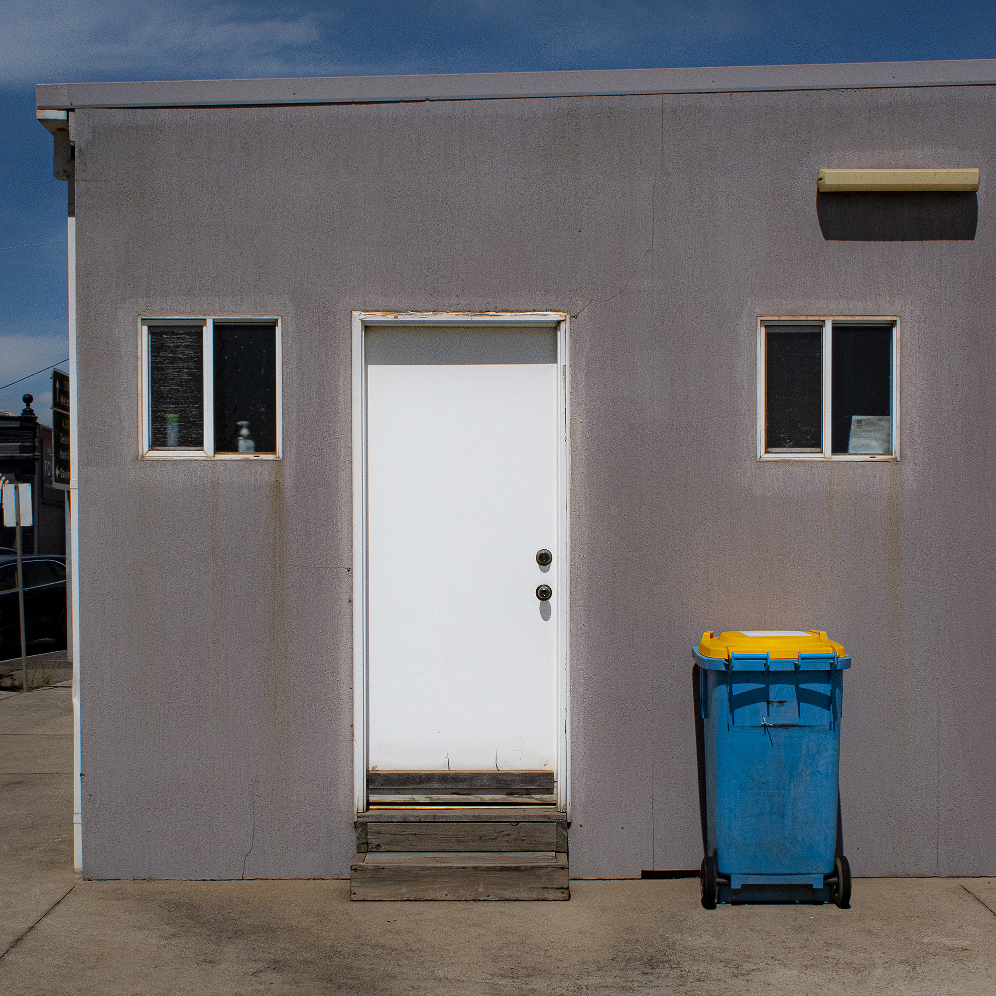
On this day I decided to interpret the old state government building, a building I often drive past. As I walked around the building I noticed a neighbouring carpark that could afford me a better angle. As I turned the corner I noticed the rear of this unassuming and slightly shabby building, a perfect subject to suit my minimalist sensibility.
What do you think are the TWO most impactful features that make your image a good photograph? Don’t be shy!
I look for compositional harmony. In this case I was fortunate to have both colour and geometry. The blue of the bin matches the sky. And there is a simple, if slightly unbalanced symmetry with the two small windows and the door – a symmetry repeated in the shadows of the handles on the bin.
If you would be able to make this photo once again, what would be the ONE thing you would like to do better or different?
I’m fussy about geometry and balance, which I correct in post production. I would have used a wider angle lens to allow me more room. The light fitting on the right is perhaps too close to the edge of the frame.
Ray Harris shared this photograph in the FRAMES Facebook Group.
Photographer
Ray Harris, Ballarat, Australia

FRAMES is a unique international photography community that combines the best of all worlds, bringing you print and digital publications, a global membership platform, access to live events, and a dedicated mobile application.
EXPAND YOUR PHOTOGRAPHIC VISION
JOIN FRAMES TODAY
John. R…
May 2, 2021 at 10:13
Yes it’s nice But if I had done the image I would have cropped the dark shadow out of the top right hand corner and also whatever building and notice board that are projected into the image on the left hand corner. Then to me it would be a much more striking image..