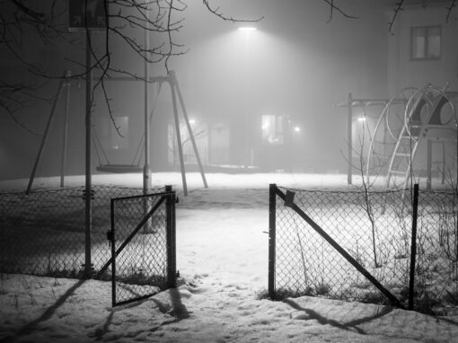

My series “Quotidian life” is all about simple urban scenes.
If we dwell on it a little, we notice that urban activity is comparable to a play where everyone knows his role without really understanding the scenario or the outcome of the complete story, all of this seems a bit chaotic but if we are able to capture images that each tell a story, all these little stories put together can ultimately form the entire play. It is comparable to a writing that comes in several volumes. My contribution is one of a secondary importance as I act as an accessory character who enjoys the show.
My fascination for the use of textures started in 1979, at the time of the darkroom, where I decided to push the rendering of my imagery further, thus bringing it into a different world, something parallel to the one in which we live. Even today, in the digital era, this fascination for textures is still noticeable.
From my series “Quotidian life”, this image is all about a simple moment of life between a mom and her child. The child seems to be almost in a contemplation mode looking at the urban decor.
In regards to the composition, it is simply built on the sinister diagonal well defined by the rear wheel of the car and the white panel above the traffic light, the heart of the action being in the first third of the image which is counterbalanced on the right by the car but especially by the “weight of the coloration”. Often we are told in the literature that the counterweights must be secondary accessories but it is often false as colors and textures can do the job in a much more subtle way.
My photography is generally in black and white or has very few colors. For this one, I tried over-saturation to add some punch to the complementary colors, the blue of the main subject and the orange-brown of the decor in general and the result rather surprised me.
What do you think are the TWO most impactful features that make your image a good photograph? Don’t be shy!
– composition built on the sinister diagonal
– use of complementary colors (light blue and orange)
If you would be able to make this photo once again, what would be the ONE thing you would like to do better or different?
– texturize differently
– lower saturation to change impact
Daniel Castonguay shared his photograph in the FRAMES Facebook Group.
Photographer
Daniel Castonguay, Canada
WEBSITE
FACEBOOK
INSTAGRAM
Equipment and Settings
Pentax K-x + smc DA 16-50mm F/2,8 ED AL

FRAMES is a unique international photography community that combines the best of all worlds, bringing you print and digital publications, a global membership platform, access to live events, and a dedicated mobile application.
EXPAND YOUR PHOTOGRAPHIC VISION
JOIN FRAMES TODAY