
In the UK from the 90s to the mid-2000s, there was a somewhat lowbrow ‘talent’ show called Stars in Their Eyes. In it, the host would interview contestants who would declare, “Tonight Matthew, I’m going to be…”. They then would dress up as the famous singer and attempt to belt out, or more likely slaughter, their favourite song. One celebrity edition was particularly memorable as Brian Blessed attempted to sing Nessun Dorma as Pavarotti. It was as appalling as it was surreal. At the end of each show, the audience would vote for a winner who would progress on towards an end of season grand finale. To me, it resembled a bad cross between karaoke and the FA cup.
Just for fun, why don’t we play a photography version? Close your eyes and think of which photographer you would most like to be. Would it be Ansel Adams with his grand landscapes? Do you feel like being Don McCullin or Larry Burrows making astonishing compositions in terrifying warzones? How about Gordon Parks and the extraordinary power of his portrait of Ella Watson? Perhaps, you want to be Eugene Atget photographing a disappearing old Paris whilst surrounded by La Belle Époque. For me, the choice is an easy one. Tonight readers, I want to be Saul Leiter.
Why Leiter when there are so many fantastic choices? From the first moment I laid eyes on his colour photographs, I was hooked. His pictures take me to worlds that stopped existing long ago or perhaps never existed at all. Attempting to unpack one of his colour photographs is extremely difficult. There is no easy way to explain what makes them so special. Is it the slightly muted colours that come from the out-of-date film he used? Is it the close attention he paid to the weather and environment around him? It is both and more. Descriptions of photography as ‘lyrical’ and ‘poetic’ are annoying overused clichés, but here they seem perfect.
Convention tells us that William Eggleston and Stephen Shore were the pioneers of modern colour art photography, but as brilliant as Eggleston and Shore are, this is a nonsense. Leiter along with Ernst Haas, Inge Morath, and others were working beautifully in colour many years earlier. Leiter also produced a considerable body of monochrome work, but whilst this is still photography of the highest standard, it does not sing like his colour work. Does this really matter? Not at all. If at the end of my days, I had a body of colour photography that is a fraction as good as Leiter’s, I would be a very contented man indeed.
As a teenager, Leiter originally had planned to follow in his father’s footsteps and become a rabbi, but his creative leanings got the better of him and, much to his father’s disappointment, he left religious study to pursue his art. He moved to New York City and began making colour images as early as 1948. He is identified as a member of the ‘New York School of Photography’ along with Diane Arbus, Richard Avedon, Robert Frank, and William Klein among numerous other luminaries. The existence of this rather nebulously defined group is disputed, but what it does show is that Leiter was working in the city at an extraordinary time for photography. It must have been incredibly inspiring and exciting for the young Leiter.
One of the great joys of writing this column is that it has given me the opportunity to work with some wonderful contemporary photographers. It is a shame that the opportunity could not be repeated with Leiter as he died in 2013 at the age of 89. However, the Saul Leiter Foundation were generous enough to allow us to use some of his magnificent images in this article.
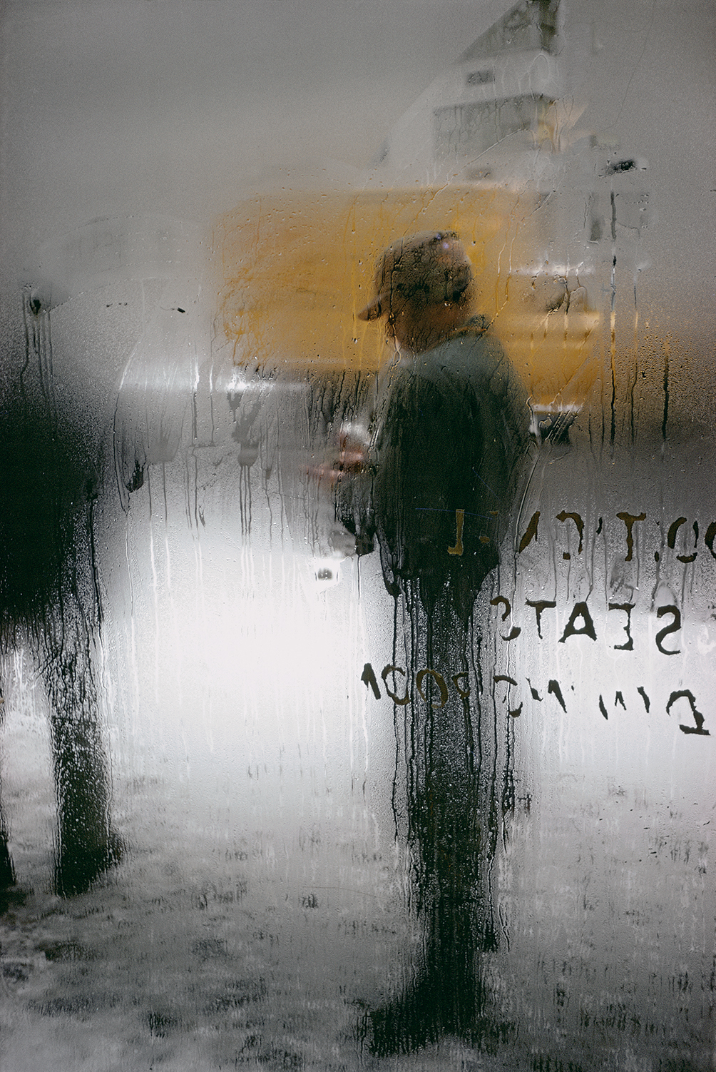
I believe that there are several consistent elements within the best of Leiter’s colour images. You inevitably find one, some, or all of these in each picture. These are deliberate isolation of a small part of the photograph, glass often with reflections, attention paid to the weather, and a thorough understanding of how colours fit together. Our banner image, Snow, is a perfect example of all these elements coming together in one photograph. The image, originally thought to have been taken in 1960 has recently been re-dated to around 1970, is a favourite of mine. The world outside the steamed-up window comes alive. It conjures visions of a grim grey day broken by flashes of colour. It is a gem of a photograph.
© Saul Leiter Foundation, courtesy Howard Greenberg Gallery
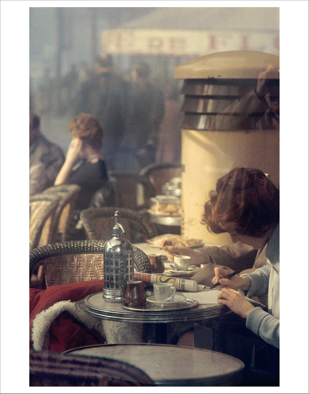
Our second picture, Paris, again contains multiple elements, but it had me puzzled, so I spent time with it and tried to notice everything in the picture. During this process, I realised that it contains a self-portrait. Initially, all my attention had been on the woman sitting at the table. I have no idea if the arrangement were a set up, but if it is, it could not have been done better. The reds on the coat and newspaper are perfectly placed as is the leading line of tables and chairs through the middle of the image. The overall composition is so good that it took me some time to realise that just above the woman on the right, reflected in a window, is Leiter himself. Of course, the image is much more than just its colours and composition. It is a story of place and time. It takes us to Paris in the 1950s. We could almost be patrons at the café, sitting at an outside table, and watching on as Leiter makes his photograph.
Saul Leiter Foundation, courtesy Howard Greenberg Gallery
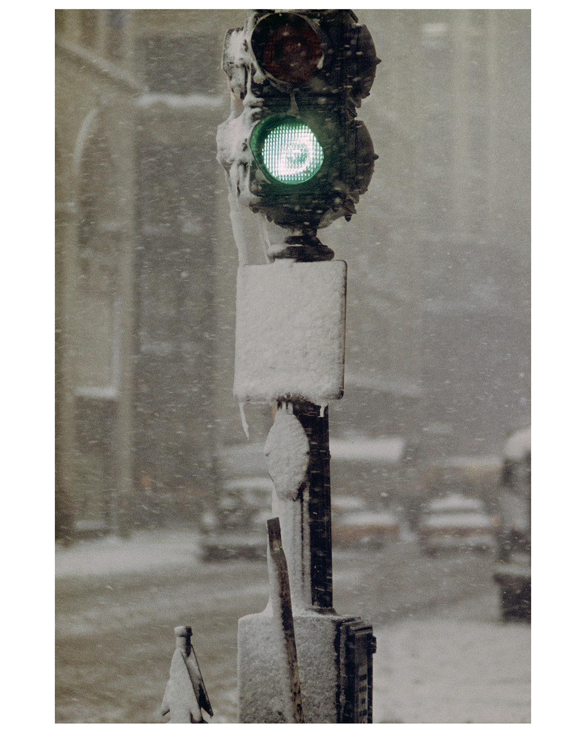
Our third photograph, Green Light against Grey, dates to Leiter’s earliest colour work, but still contains the elements consistent with his later images. Here he makes a traffic signal into something beautiful. The isolated green light works so very well against its black housing and the snow filled background. It is a simple, but wonderful photograph. Just like Snow, it takes you to the city on a foul day, but despite the weather, you experience something magical.
Saul Leiter was one of those rare photographers who we can happily describe as a genius. For too long, his place as a pioneer in colour photography was left out of the narrative. It is time for that to change. His work is a constant source of inspiration and should be required viewing for any aspiring photographer looking to make colour work. Since I first discovered his work, I have been trying to recreate his aesthetic in my own photographs and if I am honest, I have failed dismally, but it has been, and continues to be, an awful lot of fun trying.

FRAMES is a unique international photography community that combines the best of all worlds, bringing you print and digital publications, a global membership platform, access to live events, and a dedicated mobile application.
EXPAND YOUR PHOTOGRAPHIC VISION
JOIN FRAMES TODAY
Talal
December 11, 2020 at 21:36
Inspiring article Rob .
For the first time I notice his reflection on the photo Paris which is one of my favorites.
When I see Leiter’s photos I get that strong feeling of the time !!
Robert Wilson
December 12, 2020 at 01:26
Thank you!
Greg Cary
December 12, 2020 at 02:10
I’ve heard of very few photographers aside from Ansel Adams. I will make the effort to look at more of Leiter’s work.
A very well-written piece, Rob.
Robert Wilson
December 12, 2020 at 16:21
Thanks Greg!
Stephen Campbell
December 12, 2020 at 03:18
Very interesting vignette of Saul Leiter’s work. I know little about his work; but, this will have me explore more. Thank you for wetting my appetite.
Robert Wilson
December 12, 2020 at 16:21
My pleasure!
Michael Lehrman
December 12, 2020 at 09:25
Your analysis deepens and broadens my understanding of Leiter’s work. Thank you.
Robert Wilson
December 12, 2020 at 16:21
My pleasure!
Gary McQuerrey
December 12, 2020 at 17:48
Very enjoyable and informative read! Thank you so much! I love his work!
Robert Wilson
December 12, 2020 at 21:02
My pleasure!
Cynthia Gladis
December 13, 2020 at 02:44
Thanks for this article, Rob, I enjoyed it very much. “Paris” is going to haunt me. What a gorgeous image!
Robert Wilson
December 13, 2020 at 16:07
My pleasure! It is a fantastic image, isn’t it?
Julie Ross
December 13, 2020 at 03:04
Interesting and educational for me. I appreciate the aesthetics of great photography but know so little about the great photographers. Thank you for helping me on my way.
Robert Wilson
December 13, 2020 at 16:07
My pleasure! 🙂
Stephen Campbell
December 14, 2020 at 06:08
Once again a huge Thank You Rob. You have opened a new vista for me. If any of you would have an interest in seeing an interview of Sal, I certainly enjoyed viewing this:
https://www.youtube.com/watch?v=GLUwFf4iv9E
Robert Wilson
December 14, 2020 at 14:28
Thank you Stephen! I’ll check the video out.
Perry J. Resnick
December 16, 2020 at 19:28
Well done Robert!
Perry J. Resnick
December 16, 2020 at 19:29
Well done Robert! Thanks for the perspective.
Robert Wilson
December 16, 2020 at 20:15
My pleasure! Glad you enjoyed it.
Cheyenne Morrison
December 19, 2020 at 00:35
Lovely article, I too agree that Leiter is a genius and does not really get the credit he deserves. Unlike Cartier-Bresson and Ansell Adams who constantly self-mythologised their place in photography history photographers like Leiter, Josef Sudek, and my favourite Eugene Atget quietly for many years just practised and perfected their art. In preparation for my own article on him I delved into his technique and this may help you emulate his look.
“A window covered with raindrops interests me more than a photograph of a famous person,” Leiter says in the 2014 documentary In No Great Hurry. His photographs often feature passers-by glimped through doorways, reflected in windows, or concealed by layers of foreground obstructions. They never blatantly present a subject, and rather take their time to unveil mood, setting, and narrative, with rich yet hazy detail. There’s something new to see each time you look.
He shot with 150mm lens, a Tair 133m f/2.8 or 135mm f/1.8 lenses would give similar effect
Leiter’s most reproduced image is the horizontal Taxi (1957) which was shot using a telephoto lens, perhaps as long as 300mm. The shallow depth of field and flat planes a long lens produces renders out-of-focus objects a painterly single blob of colour, a technique Leiter used in his fashion work for Harper’s Bazaar.
Of his colour street photographs, Worker (1956), Limousine (1958), Don’t Walk (1952) and Pipes (c1960) published in Early Color may also be 300mm lens shots, as could be Window Dresser (c1956) in the 2008 Photo Poche/Photofile monograph on Leiter.
“I liked different lenses for different times. I am fond of the telephoto lens, as I am of the normal 50 mm lens. I had at one point a 150 mm lens and I was very fond it. I liked what it did. I experimented a lot. Sometimes I worked with a lens that I had when I might have preferred another lens. I think Picasso once said that he wanted to use green in a painting but since he didn’t have it he used red. Perfection is not something I admire. [Laughs]. A touch of confusion is a desirable ingredient. Indeed, the telephoto lens, which compresses the image, has very interesting visual painterly qualities. The distance allows you to relax and compose more freely, without shooting blindly hoping to be lucky.”
Saul Leiter, Nov 4, 2013
Robert Wilson
December 19, 2020 at 14:52
Thank you for your thoughts!
Darren Lehane
December 19, 2020 at 09:13
It’s always the same old names cited as the “pioneers” of colour photography. As much as I loved the work of Leiter, Eggleston, Haas etc – this is a biased American-centric late 20th century nonsense.
The real pioneer of colour within “art photography” was the Danish photographer Keld Helmer-Petersen. His 1948 book “122 Color Photographs” pre-dates all of them – and his influence has been acknowledged down the years by the likes of Eggleston and Martin Parr.
Yet he has become a footnote in history.
Robert Wilson
December 19, 2020 at 15:00
Thank you for your input.
I think it depends on how you want to define pioneer.
If it is the first people making photography that can be considered ‘art’ in colour, then surely we would have to go back to the likes of Heinrich Kuhn, John Cimon Warburg, Marcel Meyers, and others who were making early 20th century colour autochromes.
Randy
December 19, 2020 at 17:08
I love the tonality and mood of the Paris image. However, I am always bothered by the tight crop on the right. I would love to see another 12 inches so the woman writing wouldn’t be cut off. Am I crazy?
And I too just noticed Leiter ‘s reflection. Confirms a skillful street shot.
Robert Wilson
December 21, 2020 at 14:28
Hi Randy,
You’re not crazy at all. We have different ways of interpreting photographs of course. I can certainly see where you are coming from. I’m okay with the crop as is because it focuses my attention on that wonderful line through the image.
Thank you for your thoughts!
Cheers
John Patterson
December 19, 2020 at 18:10
A very enjoyable article and I agree with everything you say. It’s true that William Eggleston, and others, claim to be the people who brought colour to art photography. But Saul Leiter was producing sublime colour images more than 20 years before Eggleston’s inaugural exhibition at MOMA in 1976.
The problem for Saul Leiter was that he kept the images to himself for about 40 years allowing others to take to the credit. Not that it would have bothered Saul Leiter very much. He seemed to be easy going an affable with little in the way of an ego. A wonderful artist and I hope that the Saul Leiter Foundation allows the world to see more of his work in due course.
Robert Wilson
December 21, 2020 at 14:30
Hi John,
Thank you for your thoughts!
I’m glad you enjoyed the article.
I must say that us here at FRAMES really appreciated the Foundation allowing us to the images.
Cheers,
Rob
Richard Young
December 20, 2020 at 18:00
Interesting article, thanks. Leiter, Haas, Frank and others were a part of the New York set that included painters, authors/poets (the early Beats) and musicians (improvised Jazz) all challenging contemporary aesthetics. Leiter is a painter that crossed the boundary. The color images resonate with the work of the New Yorks School of painters. Leiter lived opposite to de Kooning for example. His aesthetic and experimental approach in the early days, is more complex than meets the eye, the interactions between them warrant a further and detailed examination in my view.
Robert Wilson
December 21, 2020 at 14:31
Thank you for your thoughts Richard!
I imagine that New York at that time must have been an amazing place to be producing creative work.
Chris A.
December 27, 2020 at 13:25
I am new subscriber and exploring the online content as I await my first printed edition. I have read your last 2 articles and feel like I have received my full value in subscription. Both are excellent themes we should consider and think upon. Thank you
Robert Wilson
December 27, 2020 at 15:29
Chris, thank you so very much for your kind words.
It’s comments like this that make every minute spent on the article well worth the time!
Nigel Walker
December 29, 2020 at 14:57
Great article and he certainly set a high standard for anyone wishing to call themselves a street photographer but, for myself, his far more intimate pictures of his female friends and lovers taken in his flat (with a small number published via the Saul Leiter Foundation in the book “In My Room”) are even more amazing. Taken with natural light he exposes a close intimacy which is clearly real and shared by those who modelled for him – or allowed him to take their photographs – in moments of quiet reflection and intimacy. They seems to search for the soul of the women rather than being a titillation or representation of the female form. It is the knowningness and kindness which these pictures represent which impacts on me. Their softness also varies massively from his work for Harpers, Vogue and the big fashion magazines he worked with. They seem far less known than the street work so perhaps another article another time about this very different, unique and lovely work would help others find it. Only Sally Mann’s photos of her young family seem to touch the same intimacy without intrusion . Well done and thanks.
Robert Wilson
December 29, 2020 at 15:00
Thank you Nigel! Always good to hear your thoughts. It’s lovely that Leiter inspires in so many different ways.
Sally Mann’s work is amazing as well. I think she should be a subject of a future article!
Luiz Henrique Xavier
December 31, 2020 at 15:40
Great article! I’ve read all the comments which made this discussion very stimulating. All I want to do now is going out and photograph and try different ideas.
Thanks!
Robert Wilson
December 31, 2020 at 21:51
Great to hear that you enjoyed the article!
Good luck with the images.
Megan
January 4, 2021 at 16:15
I recently read someone’s suggestion for the coming year, to read up and study one photographer every month of the year. Saul Leiter will now be my first after this article really wet my appetite 😊. Thank you for a very interesting read Rob!
Robert Wilson
January 4, 2021 at 16:16
You are most welcome!
Enjoy your research.
Andre Thibault
February 6, 2021 at 09:39
Always loved that photo of the steamed window looking outside….One of my top 3 favorite photographers, great read! Thank You !
Sandeeka
April 19, 2021 at 08:45
you helped me with my assignment, thanks
Robert Wilson
April 19, 2021 at 13:39
You’re welcome!